Mapping countries' GDP against Fortune Global 500 top 10
My experimentation with ggplot2 and custom functions in R, while highlighting global corporate wealth/power
I’ve been experimenting with/learning R and various packages whenever I get the time from work - to keep myself well-versed in some of the skills that I already possess, as well as to learn new tricks and keep myself updated on the new developments. As I’ve been curious about using R for mapping (GIS) for a while, this weekend I thought I should learn something new. So, I set about producing a series of maps highlighting the countries of the world with GDPs lower than the annual revenues of some of the largest companies in the world - top 10 fortune global 500 companies to be exact.
Another motivation came from reading the UN Special Rapporteur Philip Alston’s report on extreme poverty and human rights earlier this week. Two key points stood out for me, quoted below.
“Poverty is a political choice”
“By single-mindedly focusing on the World Bank’s flawed international poverty line, the international community mistakenly gauges progress in eliminating poverty by reference to a standard of miserable subsistence rather than an even minimally adequate standard of living. This in turn facilitates greatly exaggerated claims about the impending eradication of extreme poverty and downplays the parlous state of impoverishment in which billions of people still subsist.”
The report makes a very grim reading, especially given the current and potential future impacts of the ongoing COVID19 pandemic - not to mention the kinds of leadership we have in most of the major economies at this moment. While much of what Prof Alston says in his report isn’t new, particularly the criticism of the World Bank’s measures of global poverty, and of other large global bodies, including the UN agencies’ failures to tackle global poverty over the years, it is still good to see report at the highest level highlighting these issues.
Coming back to the maps I created, these maps not only show how large some of these companies are purely in terms of their economic power, I think they shed light on global inequalities too.
Here is the first one highlighting all the countries in the world that had lower GDP in 2019 than Walmart’s revenue for the year. The American retail giant is number one in the global list of companies with 2019 revenue of US$514 billion.

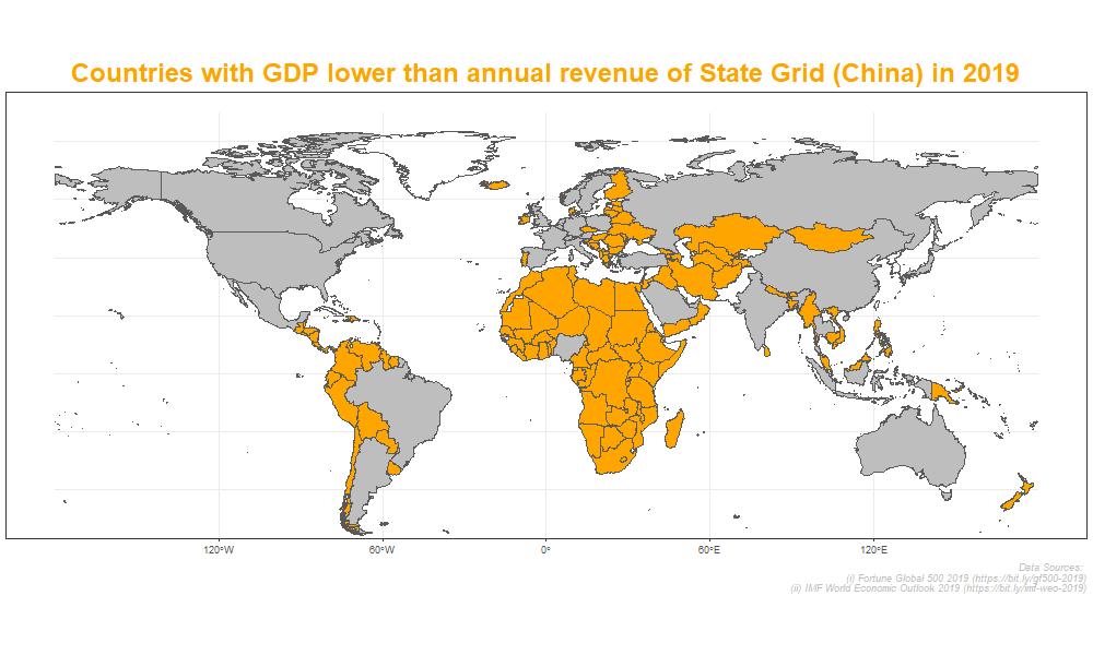
The fifth-placed State Grid of China (US$387 billion revenue) is next, map below highlighting all the countries with GDPs lower than this company’s revenue in 2019.
Finally, the map highlighting all the countries with annual GDP lower than the 2019 revenue of Toyota Motor (US$273 billion), the company ranked 10th in the global list.

As we can see, Walmart’s revenue in 2019 was larger than GDP of every single country in Africa and most of South America except Brazil. Fifth-placed State Grid of China also had revenue larger than GDP of all African countries except Nigeria, and even 10th-placed Toyota Motor had revenue larger than GDP of all African countries except Nigeria and South Africa.
I used publicly available datasets and global maps from R package rnaturalearth to produce these maps using ggplot2 and sf packages in R version 4.0.2. You can see/download data and steps, including the codes used to generate the maps from my GitHub repository.