Visualising NVivo coding with plotly treemap
My workflow to visualise NVivo coding with plotly treemap in R
TL;DR This post is only interesting/useful if you work with qualitative data and want to customise the “treemap” you get in NVivo, one of the most commonly-used computer-assisted qualitative data analysis software (CAQDAS). Basically, you can make much better treemap plots using plotly package in R using the coding frequency data that you can export from NVivo.
I’ve been coding qualitative data in NVivo for my research for the last few weeks, and one of the things I like doing as soon as I have done decent amount of coding is to visualise them in some way. While latest versions of NVivo do come with quite a few options for visualisation, “treemap”, which you can get through Hierarchy Chart option in NVivo is my favourite. The problem is I can’t do much with what NVivo provides in the way of these charts except to change colours, that too within the limited options available. So, I decided to export coding data that NVivo uses to produce these charts and use plotly package in R to create customisable treemap plots. Once you are in R, you just need the packages tidyverse, plotly and RColorBrewer for the codes below to run successfully.
I. Exporting coding data from NVivo
You basically have two options: if you use Windows version of NVivo then you can export data as .xlsx file (i.e. Microsoft Excel format); if you use Mac version of NVivo then you can export data as .csv to read into R later. Below two screenshots of Mac OS version of NVivo showing the treemap and underlying data that could be exported.
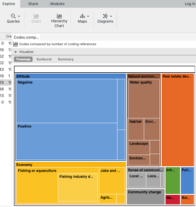
This is the default treemap you get in NVivo.
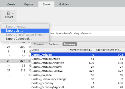
You can use Export List... menu item to export the data from NVivo.
II. Importing data into R and structuring the df for plotly treemap plot
This is the only tricky bit in this workflow as the data from NVivo needs some processing in R to the structure needed for a treemap plot using plotly package. I provide the replicable steps below with codes on data from NVivo’s built in example project.
First, read data into a new dataframe, clean it a bit, remove unnecessary columns, unnecessary strings from the Codes column, and split hierarchical nodes (coding terms) into separate columns.
# load necessary libraries
library(tidyverse)
library(plotly)
library(RColorBrewer)

# read data
# this excludes autocoded nodes (can be selected when exporting data from NVivo)
df <- read.csv("https://raw.githubusercontent.com/mpoudyal/test-data/main/data/nvivo/ex_proj_codes.csv")
glimpse(df) #check what you've just imported
names(df)[2:3] <- c("cref", "agg_cref") # simple naming for code frequency columns
df <- df[-c(4,5)] # remove unnecessary columns

# remove "Codes\\" string from the `Codes` column
df$Codes <- gsub("Codes\\\\", "", df$Codes, fixed=TRUE)

# prepare data for plotly treemap
# separate nodes (coding terms) into different columns, this is needed as NVivo exports hierarchical coding as single string with `\` separator
df <- df %>%
    separate(.,
             col = Codes,
             into = c("l1node", "l2node","l3node","l4node"),
             sep = "\\\\",
             remove = FALSE,
             extra = "merge")
Create ids, labels and parents columns for treemap plot. This step creates the three columns of codes preserving hierarchy in the structure required for plotly treemap.
df <- df %>%
    mutate(ids = case_when(
        !is.na(l4node) ~ paste0(l3node,"-",l4node),
        (is.na(l4node) & !is.na(l3node)) ~ paste0(l2node,"-",l3node),
        (is.na(l3node) & !is.na(l2node)) ~ paste0(l1node,"-",l2node),
        TRUE ~ l1node
    )) %>%
    mutate(labels = case_when(
        !is.na(l4node) ~ l4node,
        (is.na(l4node) & !is.na(l3node)) ~ l3node,
        (is.na(l3node) & !is.na(l2node)) ~ l2node,
        TRUE ~ l1node
    )) %>%
    mutate(parents = case_when(
        labels == l1node ~ "",
        labels == l2node ~ l1node,
        labels == l3node ~ paste0(l1node,"-",l2node),
        labels == l4node ~ paste0(l2node,"-",l3node)
    ))
The data is now ready to be plotted.
III. Plot the treemaps
First, treemap of all the coding.
# basic treemap
fig <- plot_ly(
    type = "treemap",
    ids = df$ids,
    labels = df$labels,
    parents = df$parents,
    values = df$cref,
    textinfo = "label+value")

# customise the plot with title and annotations
fig <- fig %>%
    layout(title = list(text = "Treemap of all coding*",
                        xref = "paper", yref = "paper"),
               annotations = list(x = 1, y = -0.05,
                                  text = "*Numbers indicate frequency of occurence for the code",
                                  showarrow = F, xref = "paper", yref = "paper",
                                  font = list(size = 12, color = "charcoal")))
fig
Output from above looks like this:
While in the interactive plotly chart above we can zoom on to the coding groups and subgroups, it is often useful to create a new treemap only for the coding group(s) of interest. Below I create two further treemaps simply by subsetting the original data and using the same basic code as above.
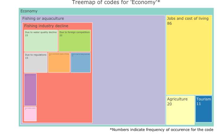
Treemap for the coding group ‘Economy’
## subset data
df1 <- df[grepl("Economy", df[["Codes"]]),]

fig1 <- plot_ly(
    type = "treemap",
    ids = df1$ids,
    labels = df1$labels,
    parents = df1$parents,
    values = df1$cref,
    textinfo = "label+value",
    marker = list(colors = brewer.pal(12,"Set3"))) # using RColorBrewer package for custom colour

fig1 <- fig1 %>%
    layout(title = list(text = "Treemap of codes for 'Economy'*",
                        xref = "paper", yref = "paper" ),
               annotations = list(x = 1, y = -0.05,
                                  text = "*Numbers indicate frequency of occurence for the code",
                                  showarrow = F, xref = "paper", yref = "paper",
                                  font = list(size = 12, color = "charcoal")))
fig1
Output from the code above looks like this:
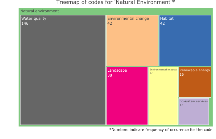
Treemap for the coding group ‘Natural Environment’
## subset data
df2 <- df[grepl("Natural", df[["Codes"]]),]

fig2 <- plot_ly(
    type = "treemap",
    ids = df2$ids,
    labels = df2$labels,
    parents = df2$parents,
    values = df2$cref,
    textinfo = "label+value",
    marker = list(colors = brewer.pal(8,"Accent"))) # using RColorBrewer package for custom colour

fig2 <- fig2 %>%
    layout(title = list(text = "Treemap of codes for 'Natural Environment'*",
                        xref = "paper", yref = "paper" ),
               annotations = list(x = 1, y = -0.05,
                                  text = "*Numbers indicate frequency of occurence for the code",
                                  showarrow = F, xref = "paper", yref = "paper",
                                  font = list(size = 12, color = "charcoal")))
fig2
Output for the above code:
As you can see above, with plotly in R, there is much we can do to customise the treemaps and produce publication-quality figures compared to basic output you get from NVivo. I hope this workflow will come in handy for those of you who, like me, want to produce figures in R but have to rely on NVivo for much of the qualitative data analysis.